NMRA, The Revised Logo; or NOT
Jim Exler L1800 (1971)
May 2026
To download a PDF of this page for sharing, click DOWNLOAD
First, let me state that I respect and appreciate the NMRA for all the work done to make Model Railroading the enjoyable activity it is. The tireless attention to standards and recommended practices have united an industry worldwide to be compatible and easily interchanged.
I also recognize, as do the members, that the officers, managers and other positions of responsibility serve our association as volunteers. Their only compensation is the thanks they receive and the knowledge that their efforts have helped fellow model railroaders in the pursuit of our great hobby. This is not intended to “throw anyone under the bus”.
We depend on the Directors to guide the everyday workings of the association but, when a change to the ENTIRE identy of the organization is proposed, the general membership should be provided with that proposal for review and comment. As far as I know, the general membership was NEVER apraised of the extent of the new plan or its content. On November 1, 2025, the president of the NMRA announced a total REBRANDING of the organization surrounded by a massive amount of hoopla and apparently his views of how it is going to be. He also stated the changes are PERMANENT and WILL NOT be changed. I find this very offensive.
I am saddened however, that you did NOT express to the membership a desire to make these changes before they were instituted and more importantly, provide the membership with a chance to REVIEW and COMMENT/VOTE to APPROVE this format before instituting it. Since we have online elections and region surveys of the members needs and ideas, it should not be any problem to have let the general membership review this rebranding.
Personally, I think spending over $60,000 for a study that could have been done by our talented and creative members is a travesty. The "fluff piece" produced by the contractor hired by the NMRA to produce a new logo and related ancillary ideas is full of type face, positioning and color info and yet produces a logo with NO "brand identification" or "hook" to make the viewer want to find out more about it.
We have many talented members who, given the chance, could have submitted designs of the logo for review. Instead, we have the "toy train" shoved down our throats. See below for my logo design idea.
According to the release notice in the December 2025 NMRA Magazine, the contractor hired by the NMRA to produce a new logo and related ancillary ideas "was immersed in a firehose introduction to the hobby among 25,000 model railroaders, and they took the opportunity to interview several NMRA members and non-members."
In the publication produced by the contractor hired by the NMRA to produce a new logo and related ancillary ideas indicating the results and efforts to create the new logo, they show opinions from 22 people by my count. This ratio of opinion to reviews comes out to 22 / 25000 or about 0.09%, in no way representative of the desires and opinions of the general membership.
|
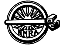
This logo served the NMRA for 74 years, is unmistakable that it is connected to railroading and never needed to be replaced. This satisfies the concept that a logo "identify" a product; there is no doubt it is referring to railroading. The steam locomotive wheel is easily recognized. Add to that the coupler which, by the way, is right handed, the same as the world recognized "hand shake", a universal symbol of greeting and welcome, an expression of respect and of course, true friendship. |
|
For a more modern approach, this logo entered service in 2011. The portion of the arc meant to represent a flanged railroad wheel works but only if you know beforehand that it is railroad oriented. Perhaps if the "rail" had been better defined, this would have worked. Some say it looks like a "boob". Perhaps the letters could stand for "Natural Mammary Refreshment Appreciation. |
|
As of January 1st, we have been presented with this logo. At first glance, it defines "NOTHING"; perhaps an umlaut gone wrong. The only way to associate this with a railroad car is to see this logo overlaid on a hopper car in the new Graphics Standards guide. It is also fitting to note that the profile for the Tonka Toy logo was a hopper car as my thought is "this project is in the toilet". Seeing this logo on a sweatshirt in the guide makes one think of "eyes" looking out from under the letters. |
|
Proposal for new logo by Jim ExlerI am not an artist but am pretty handy with Cad software and gaining on my 3D skills due to 3D printing so this is what I came up with. This was done in Auto Cad. Larry Moss and Charlie Mason, members and classmates, contributed ideas. I am sure, if given a chance, members would have other designs. Nothing can be worse than the toy like, non definitive logo we currently have. Note from my friend Steve, an Optometrist of 50 years plus: I like it! Wheel on rail, color avoiding most common R-G deficiencies. The bold color should allow most people to figure it all out. Click Here for a large image of the logo |
|
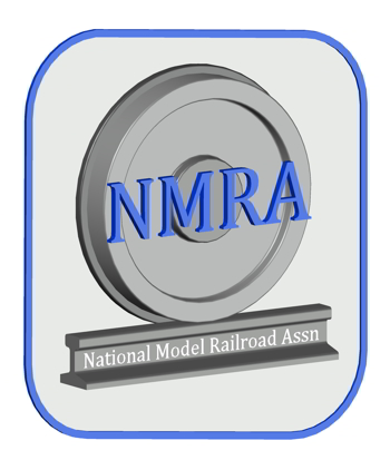
Proposal for new logo by Ryan MathewsIron Planet HobbiesJust as I thought about members designs, Ryan has presented his design from his hobby store as a fine example of a logo that could represent the association. Members would be proud to display this as would manufacturers on their literature. Ryan runs Iron Planet Hobbies in Rogersville, MO, a store and also online sales at "ironplanethobbies.com" Email Ryan: ironplanethobbies@gmail.com Click Here for a large image of the logo |
The Current Logo
The primary purpose of a logo is to act as a unique, immediate visual identifier for a brand, fostering consumer recognition. This fails in every aspect.
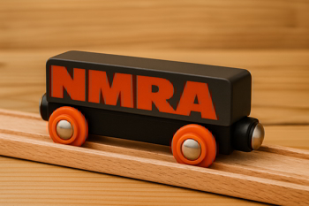
• The choice of a logo that greatly resembles a Toddlers' Wooden Slot Train seems like an aside to all the master craftsmen who have honed their skills to capture the details on all manner of rolling stock, scenery and control systems in this great hobby. It is a look backwards and not forward.
• The new logo does not claim its own space, and when placed on a photographic background, it loses all command of said space. Why not a solid-colored background such as that used on the Model Railroader magazine or the Walthers catalogs and many others.
• Or add a frame in an appropriate shape depending on the content would be much easier to place on a publication or any other object that might be used as a promotional product.
• Also, an object of any item historically connected with railroading would lead the eye to the logo. It could be a silhouette of something like a Caboose, a Train Lantern, a Semaphore, or other train related artifact. I see nothing wrong with the wheel set on the old logo.
• The color of the typeface is overpowering, especially given the oversized bold type. Maroon would be a much better choice if you wish to stay in the red scale. The red ink bold page numbers serve no real function, and the bold red column headings are overpowering and another distraction.
• The type above the logo on the front page of the newly designed magazines is almost impossible to read. It is caused by the very small type and the lack of contrast with the background.
Color RED in the Magazine
Yesterday, a friend of mine who has Red / Green color blindness came over to visit. This condition affects about 8% of men and 0.5% of women.
He knows nothing of MRR or our association.
I handed him a copy of the latest magazine and asked what he saw on the cover. He replied that he could make out the NMRA letters (he has no idea what they mean) but they were subdued.
I asked about the "dots" and he said, "what dots". Even after I pointed to one of them, he stated that it was just a blur.
The writing in the trees at the top was also a blur but then, I have to look with a strong light to see it myself. I have noted that in the NMRA Graphic Standards manual posted on the web site, a sample magazine cover is shown but the logo is displayed on a solid contrasting color banner and the small writing is much clearer. Why doesn't the magazine follow the standard?
I opened the magazine to the "Mail Car" section and my friend could not read the red printing at all, stated it was just a fuzzy blob.
I noted in the March issue, there was a reply from Riley about visual impairment but that stated NOTHING about COLOR BLINDNESS.
If the 8% number is correct, do we feel comfortable excluding that percentage of our members from being able to read the magazine? That is what may be happening.
The latest issue is loaded with more RED ink. The lower contrast level of the red text makes it harder to read; particularly with OLD eyes.
The logo on the cover is a joke and the additional writing on the cover is hard to read due to its placement in the TREES.
If you look in the Graphics Standards guide, you will see examples of multi colored region patches and other items converted to "all RED"; ugly hardly explains it.
Members Take Note - You need to express your opinions to the leaders
The Board of Directors is the ultimate control of the association. In the Corporate Policies Manual, it states that directors are responsible for "Transmitting to the NMRA such recommendations as are made by Region members" among other similar text. How can they know what the members think if they do not survey them?
In the NMRA Member Code of Conduct Manual, it states in part "Collaboration and co-operation are vital for the success of our hobby and our enjoyment of model railroading and everything it has to offer. It goes on to state in part "Constructive and healthy discussions and interactions are encouraged and in fact vital to the success of our hobby".
Need I remind the Directors and other association officers that they are first and always, MEMBERS. The failure to involve the general membership in the design and implementation of the new logo and magazine revisions is in violation of the principles outlined in the listings above. Every reply that I have seen by an association officer to a member's comment or complaint has ended the same. Basically we hear you but WE have decided and that is how it is going to be, end of discussion. Fraternity and Democracy my ...
On the NMRA web site, please read the page "Promotional Materials for 2026" to see the reference materials and some of the new rules.
From January 1st, 2026, the current NMRA.org logo will no longer be authorized for use or wear on NMRA-produced items without permission from the Board of Directors (BOD). All Regions and Divisions will adopt the NMRA's Brand & Style Guide.
These "rules" and several others depict an air of "demands from the King" rather than that of a fraternal organization. Does this mean your jacket with all the various NMRA railroad patches can no longer be worn? Dispose of your coffee cups and other items with the old logo.
As members, we have the right and responsibility to have our voices heard. If you are unhappy with the new changes and logo, please contact your fellow model railroaders for their opinion and positively express that to the leaders of the NMRA. In this way, we as members can be heard.
It is always easy to complain but I feel that, if you file a complaint, be ready with a solution!
My Solution; your ideas may and will vary.
It has been stated that the many regions and divisions all seem to have their own “logos” without any standardization. This is my proposal.
I think the main NMRA logo should be in the form of a medallion Many of the railroads in the county have this as their logo as do some of the NMRA Regions.
This same medallion concept can be carried over to the regions so that in a newsletter, for example, the NMRA medallion and the Region medallion could bookend the header with text content between making a nice clean presentation.
The medallion concept also lends itself to creating an actual physical medallion that could be used with awards etc.
With our Conformance and Inspection program, the medallion logo would be more likely to be included on a manufacturers packaging than the current “Tonka Toy”.